
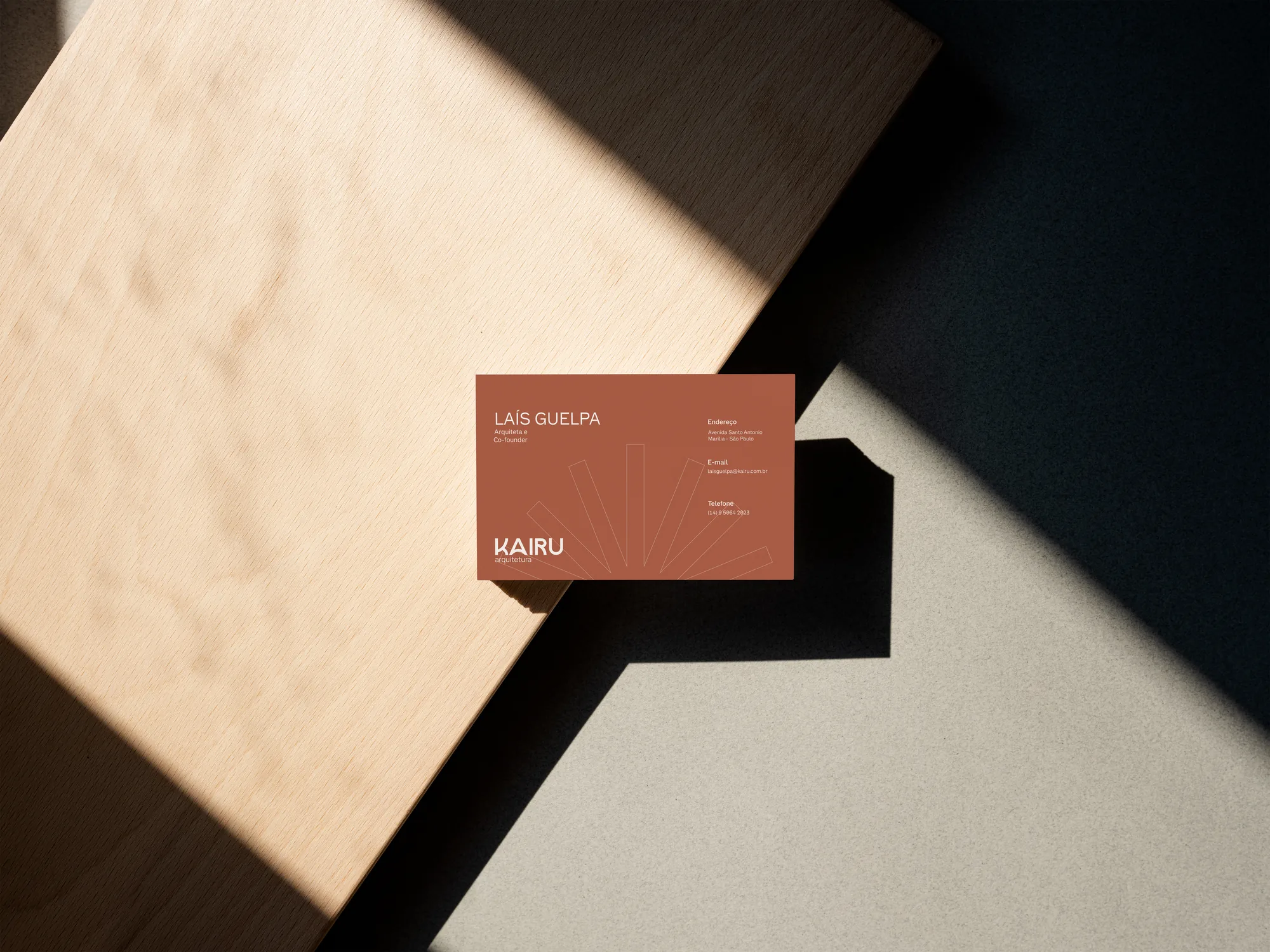
Kairu Arquitetura Brand identity
A brand for a practice that brings together architecture, interiors and diagnostic engineering: the solidity of a house and the light of the sun.
- Client
- Kairu Arquitetura
- Sector
- Architecture and engineering
- Services
- Brand identity, brand guidelines, stationery and social media
- Year
- 2026
A new practice that needed to look established from day one
Kairu brings architecture and interior design together with diagnostic engineering under one roof: inspections, expert reports, technical documents and property regularisation. It came to us one week after opening, with a clear worry: looking amateur, or too young, in a market of established names.
The brief was an identity in which creative proposals and technical documents speak the same language. A quiet, clean, timeless design that conveys trust without having to shout.
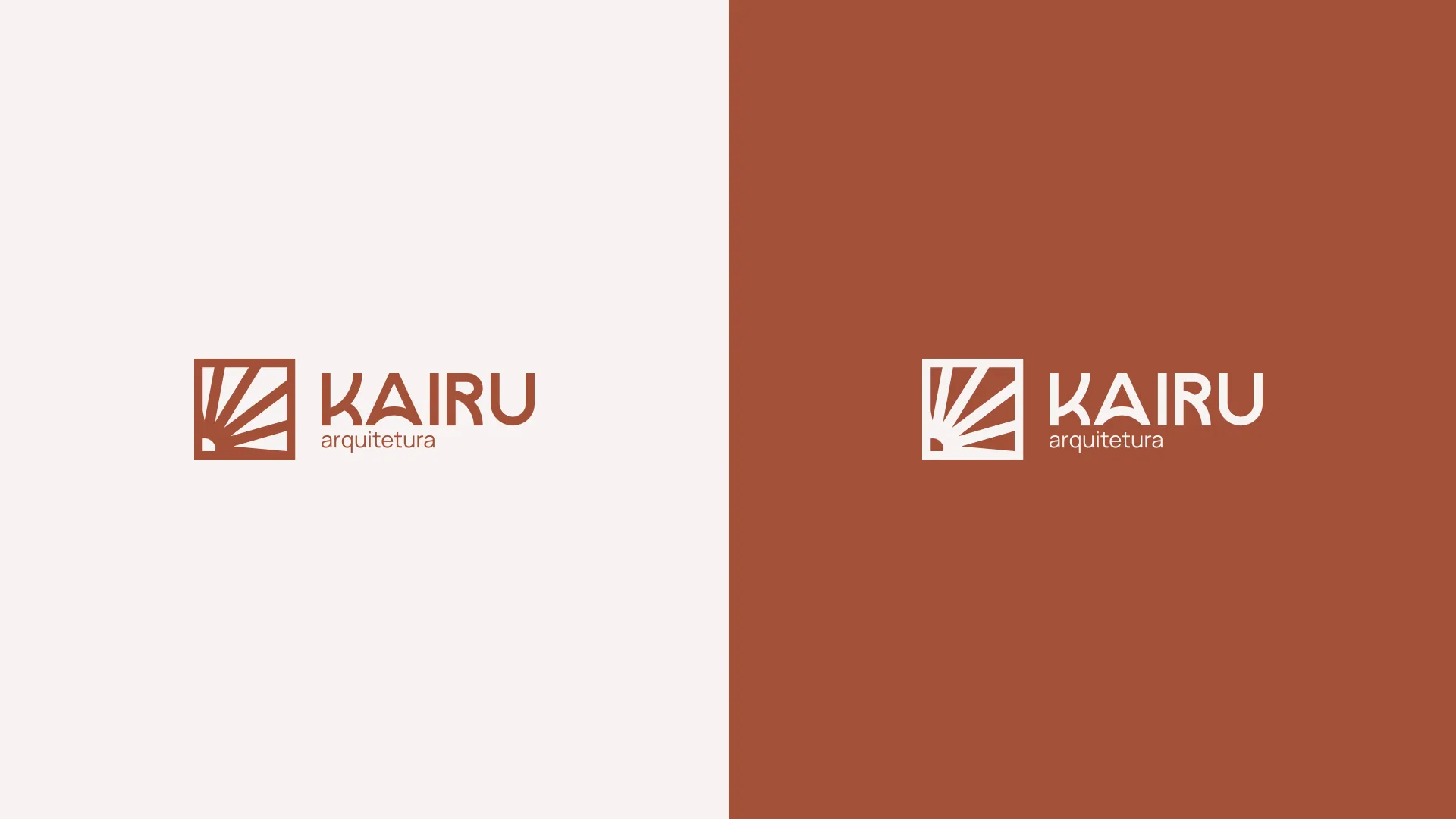

House of the Sun
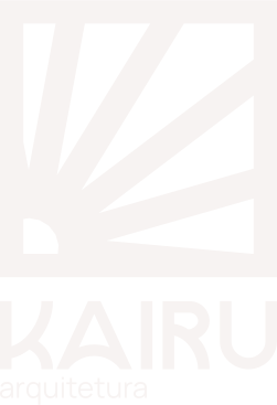
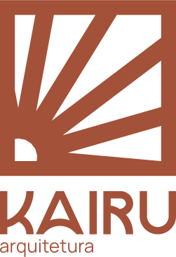
Kairu comes from Tupi-Guarani and means "House of the Sun". The symbol turns that idea into a cobogó, the perforated block of Brazilian architecture, crossed by a rising sun.
- 01The squareThe structure: the house, a shelter built with technique.
- 02The gridThe cobogó module: repetition, rhythm and origin.
- 03The raysThe sun: the light that passes through and brings the space to life.
- 04The circleThe point of origin: the sun at the heart of the house.

Strichpunkt Sans
Rounded shapes with angular details: authority with warmth.
- Regular400
- Medium500
- SemiBold600
- Bold700
From the sketch to the survey, Kairu delivers.
A family of cobogós
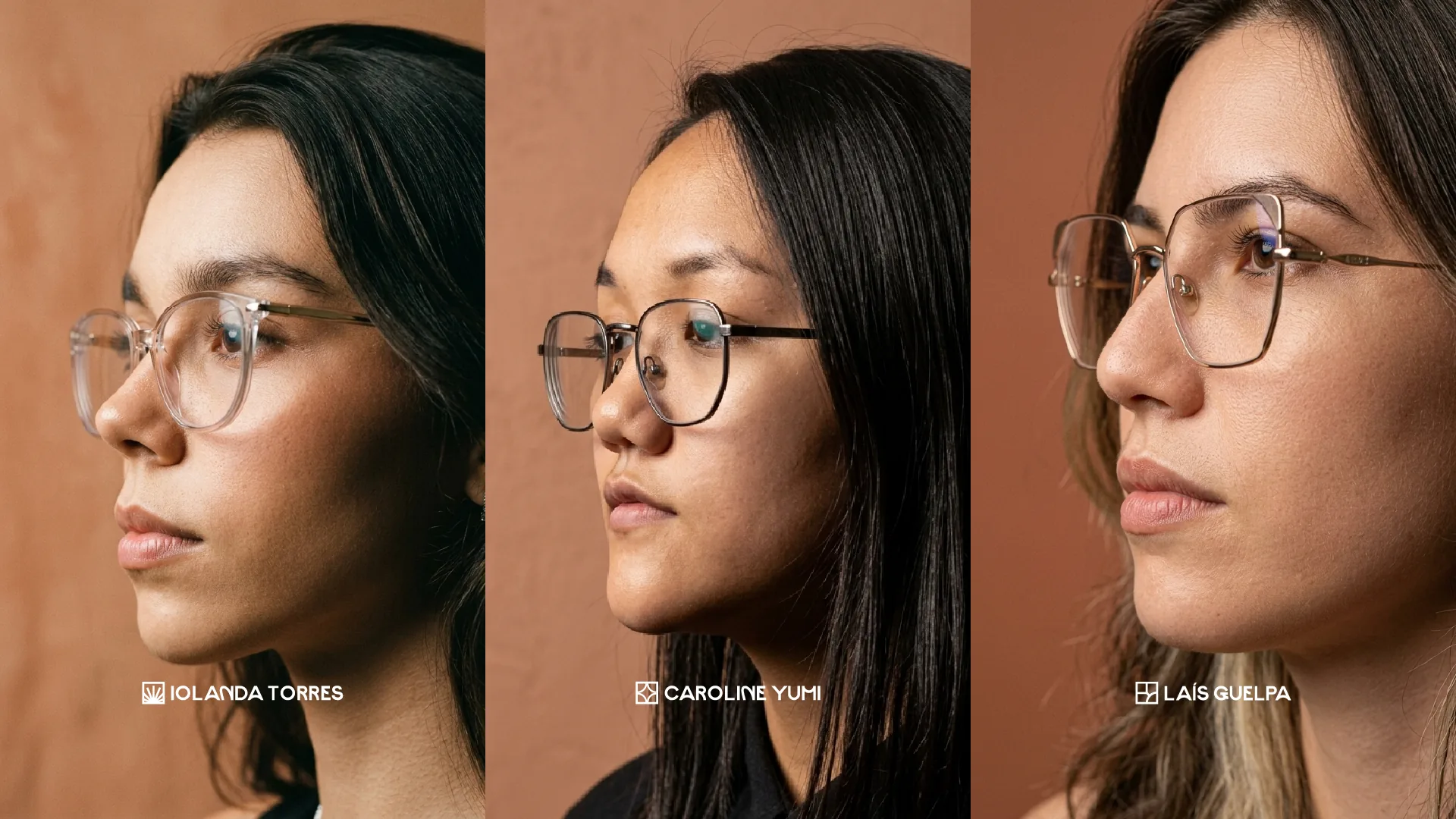
Each icon lives inside the same thick-bordered square. Different pieces, the same origin.
 Solar
 Uman
 Concal



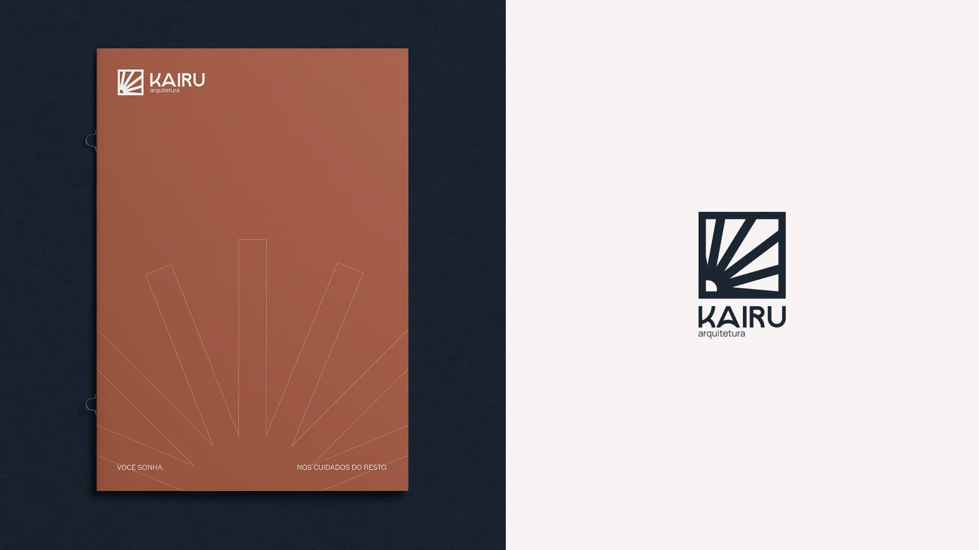
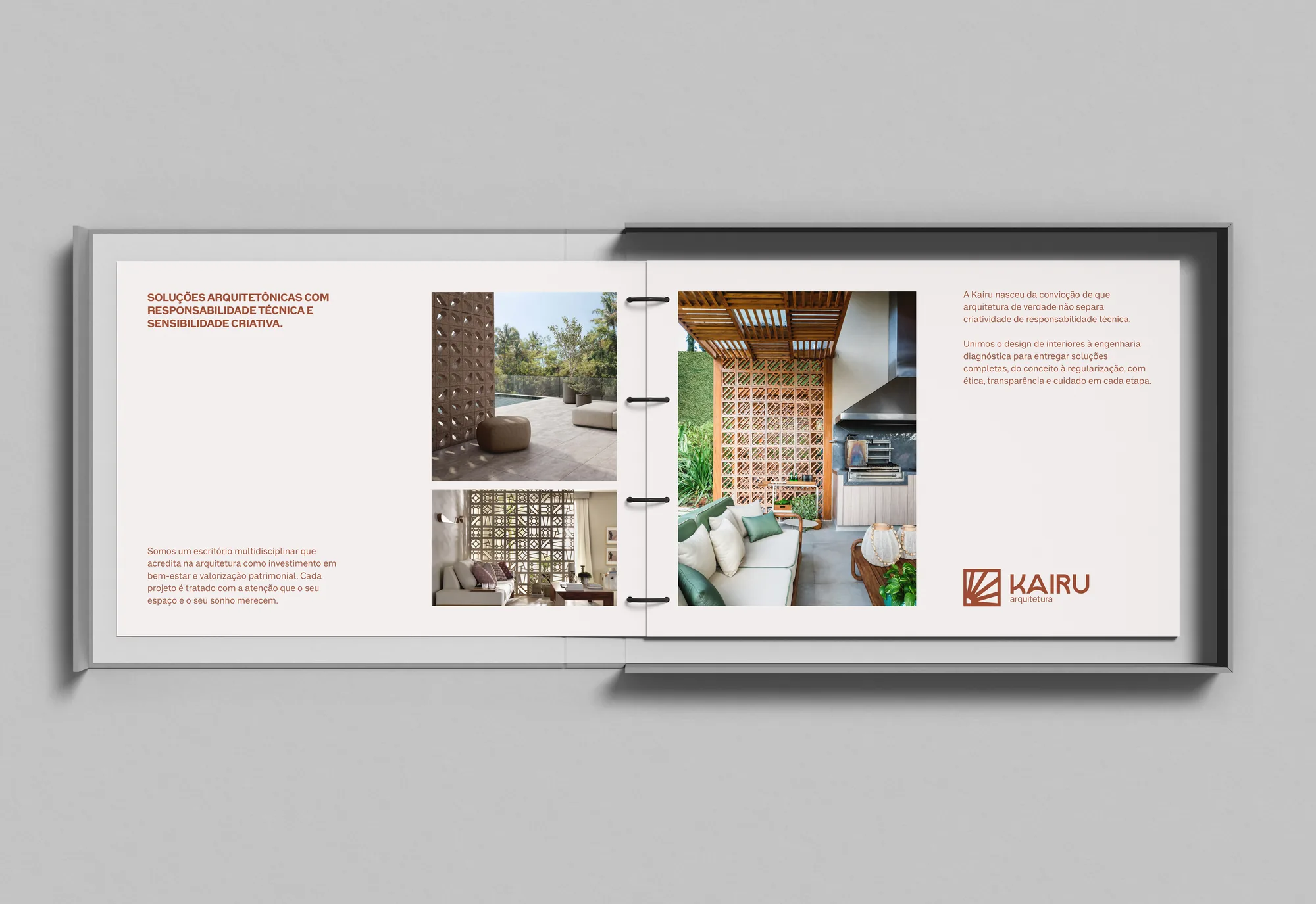
From the business card to the portfolio, the same voice
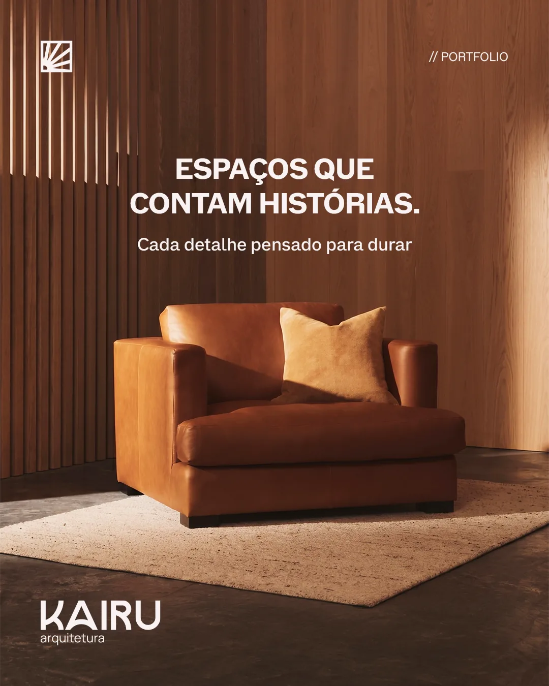
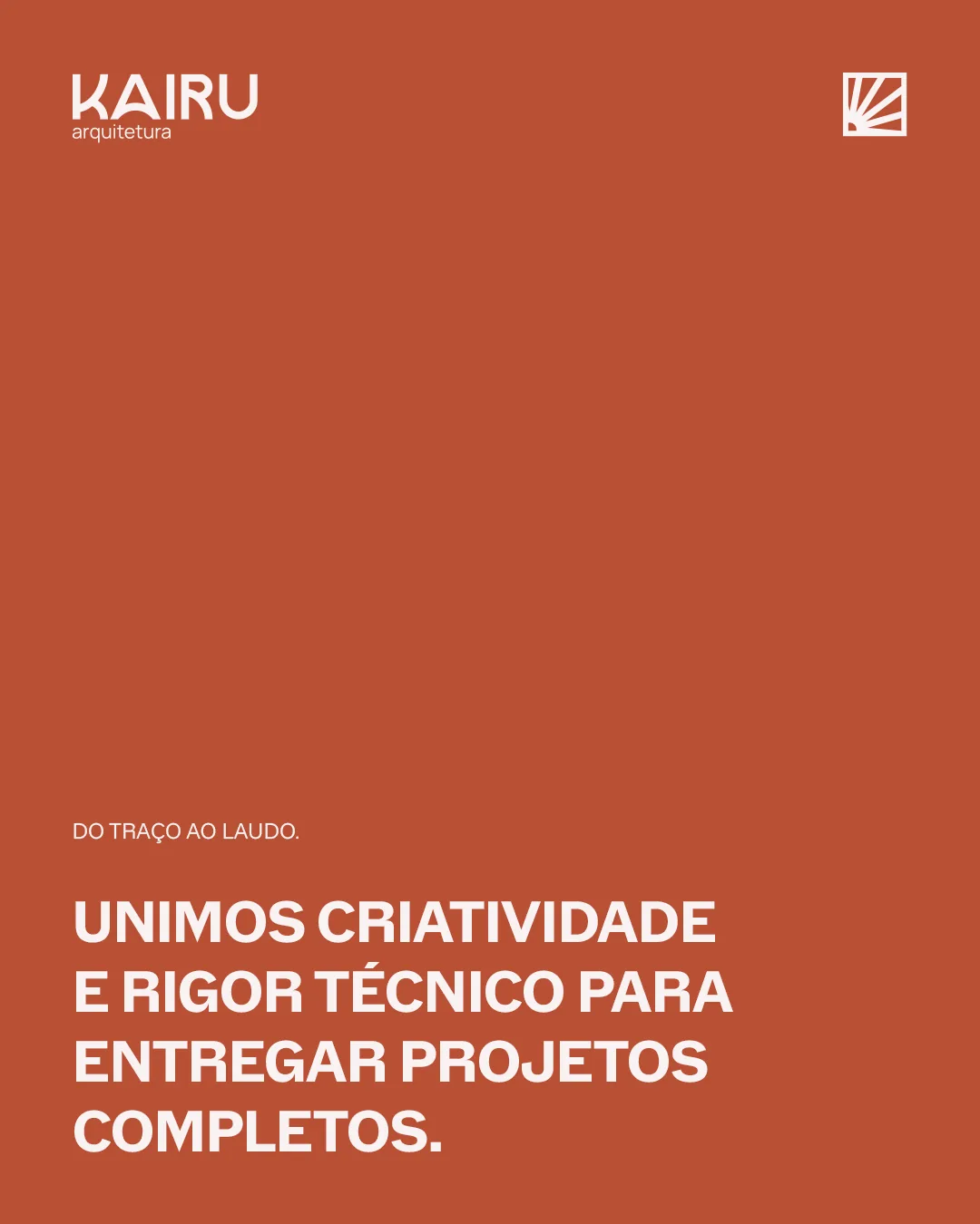
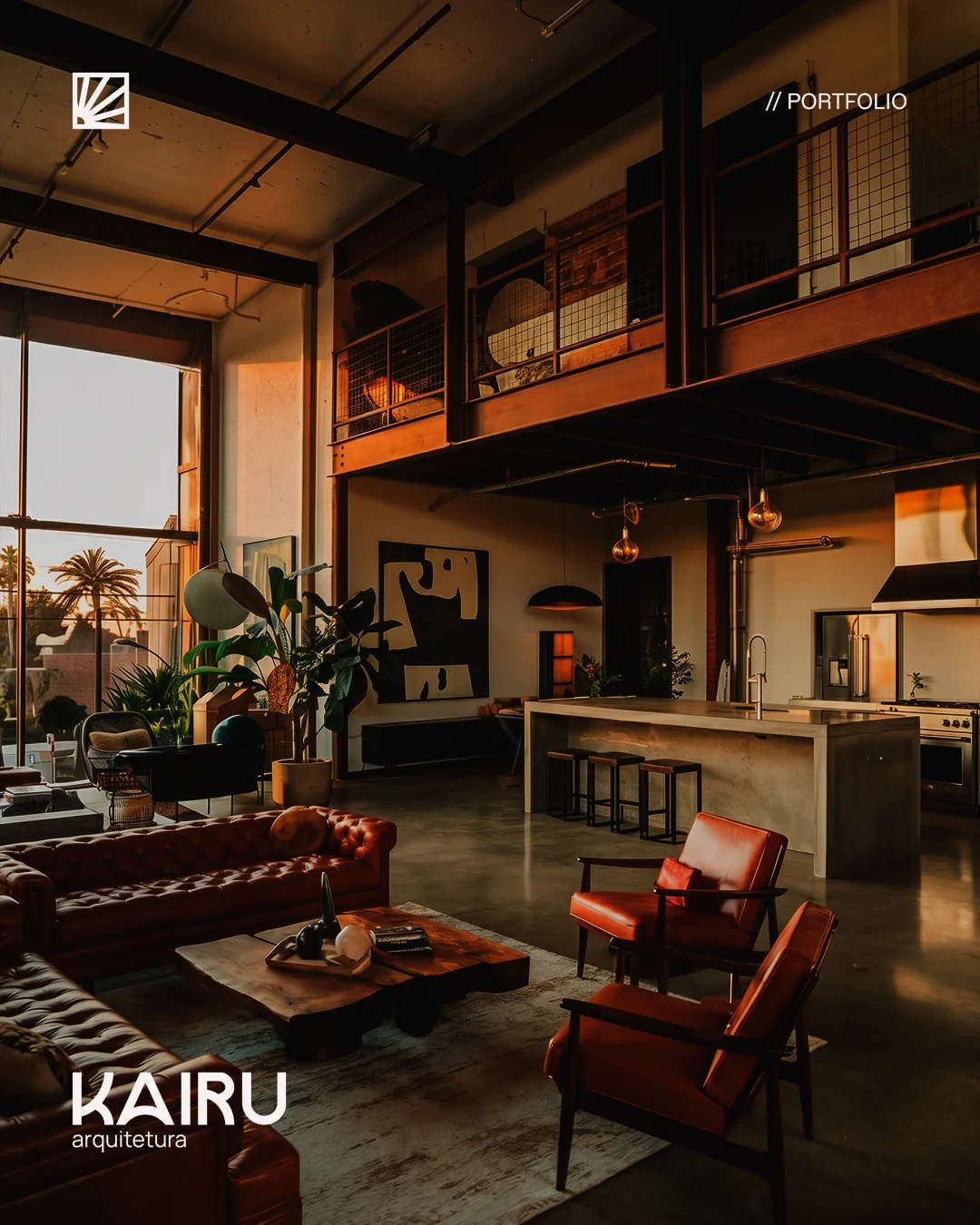
The identity was delivered with brand guidelines, stationery, social media templates and a context document so the team can keep creating consistent pieces day to day.
Sebastian Ciprian Brand identity
↗Shall we create your brand?
We reply within 24 business hours.